deCordova Sculpture Park and Museum
Lincoln, MA
January 22 – April 22, 2012
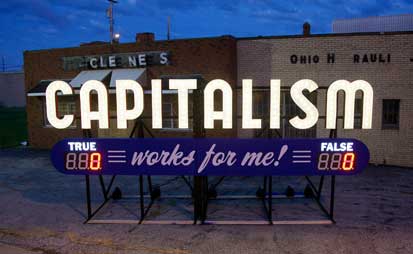
Aluminum and electronics
9 x 20 x 7 feet
Electronics by Alexander Reben
Courtesy of the artist and SPACES, Cleveland, OH
Approaching the entrance, one is welcomed by a large lighted sign vividly displaying the question: Capitalism Works For Me! True/False? One can press a button to vote for either extreme. (I did.) The sign, like a scoreboard, displays the tally of votes. This work, by Steve Lambert, is accompanied, by his Trust Me (displaying that message above the entrance desk) and by a film about the Capitalism Works for Me project in the first floor gallery.
In the film, Lambert, in an appealing way, describes his interest in creating the project as a vehicle for reflection and discussion on our established economic paradigm. After its run at the deCordova, the piece is slated to be displayed in various locations in Boston. This straightforward, but interesting and colorful, project, is one of a number at this show with a vivid social dimension wittily integrated with its aesthetic one.
Twenty-three artists, of quite a range, are represented in this biennial.
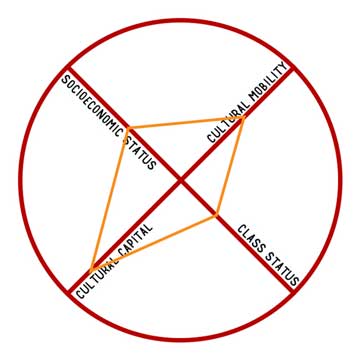
9in x 9in print of similar template to
larger one displayed in Biennial
Courtesy of the artist, www.caitlinberrigan.com
Another artist with explicit social interests is Caitlin Berrigan, whose Spectrum of Inevitable Violence (2012) includes a circular graph done in sticky tape of results of a detailed survey taken in Boston regarding quality of life. It is accompanied by a video, Class Anxieties (2012), which consists of a series of biographical vignettes. I got to see one about someone growing up in northern California and gradually coming to realization about the extent of the secondary marijuana economy there. It drew me in; I would like to go back and see the others.
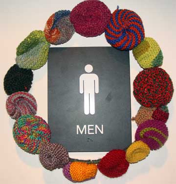
Mixed fibers and wire
Courtesy of the artists
The South End Knitters, set up in 2008, display their wares in all sorts of interesting places, dedicated to what they call yarn bombing (a wonderful oxymoron) or graffiti knitting. Here, I got to see their works adorning the Men’s Room (both the door outside and the mirrors inside) in an entertaining way. Check out their stuff online, and you will see how varied the settings can be. I wish only for a world in which yarn bombing replaces the explosive kind, breaking apart only rigid sensibilities, with color and craft.
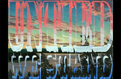
Oil on canvas
Courtesy of the artist and
LaMontagne Gallery, Boston, MA and
Heskin Contemporary, New York, NY
Joe Wardwell’s Elaborate Plans (2011), United We Stand (2011) and Acting Stupid (2011) are oils with vivid stylized titles mapped over landscapes. The pieces are at once dramatic, significant and fun, with a kind of cinematic sweep. Apparently, Wardwell uses favorite popular song lyrics for his titles.
Like titles in old Westerns, they force one’s eye away from the background landscape which itself continues to surface through the print. This witty opposition of text and landscape calls to mind how double-edged is the intimacy of word and vision: at once, word conveys the essence of landscape while, at the same time, obscuring it. The seen world, though deeply entangled with language, calls to us natively as well, asking for our undivided attention as though from behind, without imposed descriptions.
In the museum’s Process Gallery, there is a nice video showing Wardwell using layered technique to create one of his paintings.
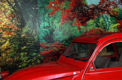
from the series Studio Karmen
Courtesy of the artist and Clark Gallery, Lincoln, MA
A room of graphical works (giclée prints), and a film, by Eric Gottesman fall under the general title Studio Karmen (2010).
Background #1 has the existential vacancy of a de Chirico painting while embellishing it, in the foreground, with real looking wood and rattan. It drew me in.
Car and Maple Tree is a collage of harmonious but discontinuous, elements, but with very vivid and rich coloration. (For eccentric car lovers, it includes a Deux Chevaux Citroen, one of my favorites.) Striking.
The entire Studio Karmen series is about the photographer, Ahmad Tahir, who lives and works in Zarqa, Jordan. I watched enough of the film, Another Beautiful, which profiles Tahir, to get a sense of his charm. With a bit more time, I would like to see the rest of it.
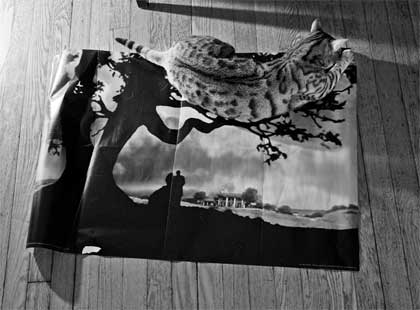
Digital gelatin silver print
Courtesy of the artist, and
Gallery Kayafas, Boston, MA
Bengal Cat On Gone with the Wind Poster, one of the pieces in the black and white photo series Any Color You Like (2010) by Matthew Gamber, is compositionally intresting and ironic, suggesting, with its real cat sitting on a fake tree branch in the poster, a version of what Magritte highlighted in his famous semiological masterpiece The Treachery of Images (This is not a pipe).
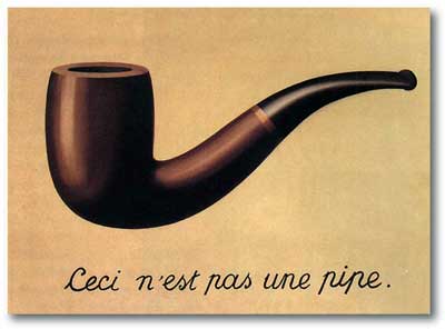
Courtesy Los Angeles County Museum of Art
I once had a cat who sat and stared at the lion in a print of Henri Rousseau’s The Sleeping Gypsy, then bolted up at the print and dashed out of the room. Gamber’s work, with real cat sitting on a fake tree branch, brought that episode to mind.
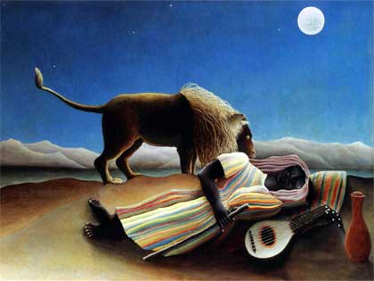
Courtesy Museum of Modern Art, NY
As well as providing semiological interest, Gamber’s photo offers a visual play between the wood floor background surrounded by shadows, and the stripes of the cat against the branches of the tree in the poster underneath.
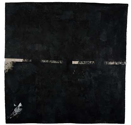
Acrylic, carbonundrum and paper
Courtesy of the artist
The Final Frontier (2009) by Cullen Bryant Washington, Jr. is a large (almost seven feet square), black, spacious, cosmic goof on Star Trek. There is a dashed line (the frontier) in the middle of the black space. It is like a merger between Ad Reinhart’s black paintings, something by Andy Warhol that plays upon pop culture images, and musings on cosmology à la Stephen Hawking.
It brings to mind the denouement in Yasmina Reza’s Art in which one of the characters tries to interpret an all white painting with the active application of a figurative imagination. Washington’s work is spatially striking in the way that an abstract color field painting is, but also provides a narrative template, and is lots of fun.
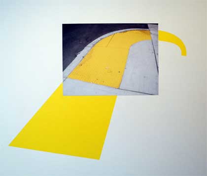
Installation of collage and acrylic on paper,
archival ink jet prints
Courtesy of the artist and Carroll and Sons, Boston, MA
Mary Lum’s oCCuPy eVerYwhere (2011) and EvErydAy AnywhErE (2011) are sequences of colorful and detailed collages. Examples of Lum’s methods are also shown in the Process Gallery. Her painstakingly detailed cutting technique reminds me of some of the work by Rachel Perry Welty I saw at her deCordova show last year. I also love Lum’s titles, daringly global, fun, and unexpectedly peppered with random upper case letters.
In Efflorences and Other Dematological Embellishments (2009), Lauren Kalman fills a roomful with color inkjet prints of elaborate piercings on a female nude body, all somehow associated with the depictions of various diseases. It is kind of a puncture-eczema hybrid of the Cindy Sherman portray-it-yourself approach with the Chris Burden do-something-painful-to-yourself approach.
Kim Faler’s three purple waxy chandeliers in various stages of melting adorn the main stairway. The 2012 installation is entitled Empire (with the name struck through). Purple is an interesting color choice: Marie Antoinette on hallucinogens, under the heat lamp of history, or the elegant imperialism of more recent regimes subjected to the same.
Chris Taylor has various glass works, including a couple of envelopes he sent through the mail and some bubble wrap that looks like it fared not too well. There is also a curious video of him, Small Craft Advisory (2009), in a small boat outfitted with a gas kiln, doing glassblowing on the water. Oddly entertaining, but don’t try this at home.
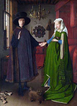
National Gallery, London
The big production for what? category includes Megan and Murray McMillan’s The Shape of Our Best Intentions (2012). It is a large wood theatre that shows a video of the artists in a similarly constructed large wooden contraption in which they ride around over the surface of some water while, in its compartment, they fold linens, apparently inspired by van Eyck’s masterpiece, The Arnolfini Portrait, looking very serious.
Musil #1 (2011) and Hamlet #1, v.4 (2011) are large silver gelatin photo montage prints by Matthew Sanders. They have embedded portraits that are quite haunting, and you need to look just a bit to find them. Sanders also has a series of jarring black and white videos of blurby forms, kind of hypnotic.
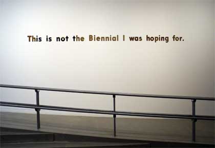
Gold mirrored acrylic
Courtesy of Carroll and Sons, Boston, MA
Joe Zane’s This Is Not The Biennial I was Hoping For (2011) is a gold mirrored acrylic sign that hovers over the main gallery. It is exactly the sort of pop reflexive work that one enjoys in a show like this, and it works well with the other sign-oriented works by Steve Lambert and Joe Wardwell.
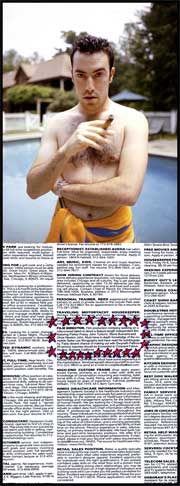
Film Director (2003)
from the series
Dream Job
Inkjet print
Courtesy of the artist
Several amusing posed photos perched above heavily marked up want ads form part of of Jonathan Gitelson’s Dream Job. They also have some of the theatrical quality of Cindy Sherman’s work, but are, in some way, more straightforwardly satirical. Sherman’s work has a tragicomic quality to it, perching its objects tentatively on the boundary between the artist’s own identity and that of her multiple subjects. Here, Gitelson similarly ribs about identity, but stands laughing at some distance.
I have not included descriptions of everything in the show, but suffice it to say that there is a lot here. As with many of the shows I have seen recently at the deCordova, there is a daring and interesting range of offerings. Naturally, I was not taken by everything. But, after running by some of the works in the “ho hum, more of that” mode, quite a few began to sink in and make an impact, a testament not only to them, but to the curatorial skills behind the exhibition. I came away feeling that, overall, this was a challenging range of offerings, particularly distinctive for its representation of works with explicit social themes.
– BADMan
Leave a Reply