Exhibition
deCordova Sculpture Park and Museum
Lincoln, MA
October 9, 2013 – April 13, 2014
The 2013 deCordova Biennial Artists: Hamra Abbas, Sonia Almeida, Nancy Andrews, Laura Braciale, Jonathan Calm, Patty Chang and David Kelley, Pat Falco, Peter Gallo, Petrova Giberson, Jacin Giordano, John C. Gonzalez, Rachel Gross, Lynne Harlow, Xylor Jane, Jilaine Jones, Ethan Murrow, Anthony Palocci, Jr., Dushko Petrovich and Roger White, J.R. Uretsky
Suara Welitoff (2012 Rappaport Prize recipient), Bahar Yurukoglu

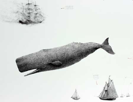
Ballpoint pen
Courtesy of the artist
and deCordova Sculpture Park and Museum
The scheduling of the so-called 2013 Biennial, trailing close upon the heels of the 2012 Biennial, gives pause to one’s consideration of the term biennial. It is nice to know that one can have such a thing the following year even though it may fly in the face of analytic scrutiny. Maybe that is a little piece of unpublicized performance art on the part of the curators, and a little wink to the larger eyes of the art world. Be that as it may, this year’s (or this two years’) biennial starts its run in 2013 but ends it in 2014, which, I suppose makes it fill the biennial bill with regard to the last one, which began and ended in 2012.
That being said, I must say that the offerings in the 2012 Biennial were quite interesting overall and had a good range of fairly dramatic examples of work being done in New England. I was taken with many of them.
This Biennial has quite a different tone than the 2012 one. Here, the emphasis seems to be on a particular kind of minimalism, something that I am inclined to dub informalism.
There seems to be an intentionally cultivated offhand quality to many of the works, as though it were not aesthetically cool to produce anything that, to all appearances, seemed like very much.
No doubt the intentional subtext of many of these works goes very deep, indicating their underlying conceptual ballast. One might consider them submarine works, each of them diving beneath a sea-level of evident aesthetic appeal in order to garner something more significant. Of course, for those of us sailing blithely upon the surface of the waves, the point gets easily missed. No doubt, curatorial guidance would readily provide some interpretive scuba gear to help us dive down and find the meanings that support what hesitantly shows itself above the rising tide.
In fact – speaking of interpretive guidance – I found that some of the most compelling artistry in the exhibition was literary – in the blurbs upon the descriptive plaques that accompany the works. Flights of hermeneutic imagination prevail there and sometimes leave one gaping in wonder at the artful improvisation motivating that verbal ink.
As I entered the exhibition, I was greeted, outside, by Home Depot House by John C. Gonzalez, which is pretty much as its title describes. It looks a lot like the sheds one sees outside the entrances of the eponymous chain store. I am sure that the layers of interpretive significance that provide the aesthetic foundation for this work are manifold but were not immediately evident from the dwelling itself. Otherwise, it was presented as a space for visiting artists to come and to meet with people who come to visit them while they are there, a pleasant enough idea.
Inside the museum, on the ground floor, I saw two videos by Suara Welitoff. The first, a smaller sized piece toned in what seemed like archival red, The Actor (2012), is a very slow-moving group scene. All the characters make micro movements but one can actually see them budge if you stay and pay attention.
I had seen a quite interesting version of this idea done by Bill Viola, shown at The Metropolitan Museum of Art in New York a few years ago. That piece, in Viola’s Quintet Series (2000), utilized five actors, as though depicted in a Flemish group portrait, moving very incrementally. It was great.
Movements in Welitoff’s Actor are less evident and a bit more difficult to follow, and the archival red does not help. It puts a lot of the attentive onus on the viewer, as do many of the pieces in this exhibition generally.
Welitoff’s other piece, consuming an entire room, is a black and white film entitled Wireless (2012), showing what looks like two guys trudging up a hill through deep snow. A repeating film, it seems like a modern, wintry version of Albert Camus’ Sisyphus.
Delightfully playful, Ethan Murrow‘s Flotilla (2013), done in ballpoint pen (I loved seeing that on the blurb next to the piece), all over the walls of the large stairway-atrium that rises to the second and third floors, depicts a bunch of boats and some sea creatures – including a beautifully rendered whale – in no seeming order, but expertly drawn and nice to peruse. A skeleton frame of a Viking ship at the bottom is executed vividly and appears to zoom out of the wall – great!
Behind The Eyes Are The Ears (2009), a video by Nancy Andrews, is a kind of fun, surrealistic romp inspired by the artist’s drug induced delirium while on an intensive care unit. I only saw a bit of the video’s 26 minutes (I don’t know, who actually has time, when coming to an exhibition like this, to sit through something that long), but it seemed pleasantly odd and offbeat.
Petrova Giberson‘s The Flowers (2013) is a three part installation consisting of a large cloth-hanging with three holes, an array of about a dozen suspended wires and three floorboards tacked to the wall. The descriptive plate next to the works says: these objects evoke an organic minimalism where unembellished, austere structures possess an aura of the natural and living. I don’t know about the installation, but the author of this deserves a literary prize.

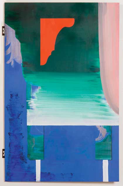
Oil on marine plywood, Xerox copy on plywood, hinges
Courtesy of the artist,
Simone Subal Gallery, New York
and deCordova Sculpture Park and Museum
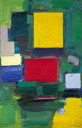
Three paintings, mostly in blue and green, comprise Sonia Almeida‘s Knight’s Move Thinking (2013). The blurb suggests these paintings question the nature of visual perception and are guided by an underlying inquiry into the nature of the art form itself. I am not sure that these paintings do that more than any other artistic works, but it is nice to know that the curator thinks so and can state it so categorically. For my money, the more dynamic parts of the piece call to mind works of Hans Hofmann, who also could deftly create colored rhythms with swabs of paint.

Solomon R. Guggenheim Museum, NY
A social impetus drives Jonathan Calm‘s Community (2013) and Scudder Towers Down (2013) which depict the demolition of urban housing projects. Community includes an intentional array of picket signs and Scudder Towers Down is a video showing the demolition in process. They bring out an important socioeconomic point and are socially relevant, but seem a bit more like epigraphic emblems rather than aesthetic inventions.

Video excerpt
Courtesy of the artist,
LMAKprojects, NY
and deCordova Sculpture Park and Museum
A large, seemingly monochromatic, orange fabric canvas by Lynne Harlow, in rhythm..distance (2012), rises obliquely overhead while a recording of drums by Paul Corio emerges from behind. The idea of a minimalist painting embellished by background music is kind of different and made me think immediately that a blue canvas with the blues playing, or an all black Ad Reinhardt canvas with Shostakovitch playing, might be even more interesting.
Congeries of minimal bric a brac and various objects which represent those are grouped together in Laura Braciale‘s Rods and Cones (2013). The reference, of course, is to the component mechanisms of our retinas which provide us with sight which inevitably represents, particularly when it has trouble seeing in other ways.
A group of variegated, creature-like windings of yarns greet one at the top of the atrium. Jacin Giordano‘s Harpoons For Hunting Rainbows (2013) is playful and fun and provides a vital and organic presence to some of the surrounding abstractions.
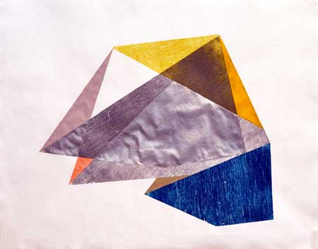
A series of colorful, quite striking, hard-edged paintings and collages by Rachel Gross filled the upper floor hallway.

“Poly Rim Silver” (2012)
woodblock relief with acrylic paint
Courtesy of the artist
and deCordova Sculpture Park and Museum
Anthony Palocci, Jr seems to be into domestic machinery and has a pretty dramatic, large and gray, painting of a window fan, which is… sorry… kind of cool.
I didn’t catch Xylor Jane’s rectangularly geometrical paintings until I got back downstairs and the museum was about to close. They are simple, but nice, and though painted, look more like quilts.
– BADMan
Leave a Reply